
The map
The map fills most of the window and is the main working area of the portal: every layer you activate is drawn on it, on top of a base map.
Moving around the map
Pan — click on the map and drag it to move to another area.
Zoom — scroll on the map, or use the + and − buttons on the right hand side. The scale bar at the bottom right updates as you zoom.
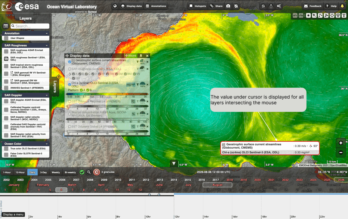
Reading the values under the cursor
Move the mouse over the map: the value under the cursor is displayed for all the layers intersecting it, in a box at the bottom right. Each line gives the name of the layer and its value in the unit of that layer — in the example below the geostrophic surface current, 0.39 m/s at 93°, and the chlorophyll-a concentration, 0.33 mg/m³.
Choosing the base map
The base map is the background drawn under your data. Click on the globe button in the toolbar at the top of the window to change it:

The list of available base maps opens, with a tick next to the one currently in use. Click on a name to switch to it:
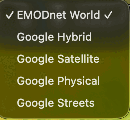
EMODnet World, the default, shows the bathymetry, which is convenient when looking at ocean data. The four Google base maps are useful for a different context: Satellite and Hybrid for imagery — the latter with place names and borders drawn on top — Physical for relief, and Streets for coastal and land features.
The timeline
Moving through time, selecting a time range, animation.
How to play with time and timespan
Selecting a timespan
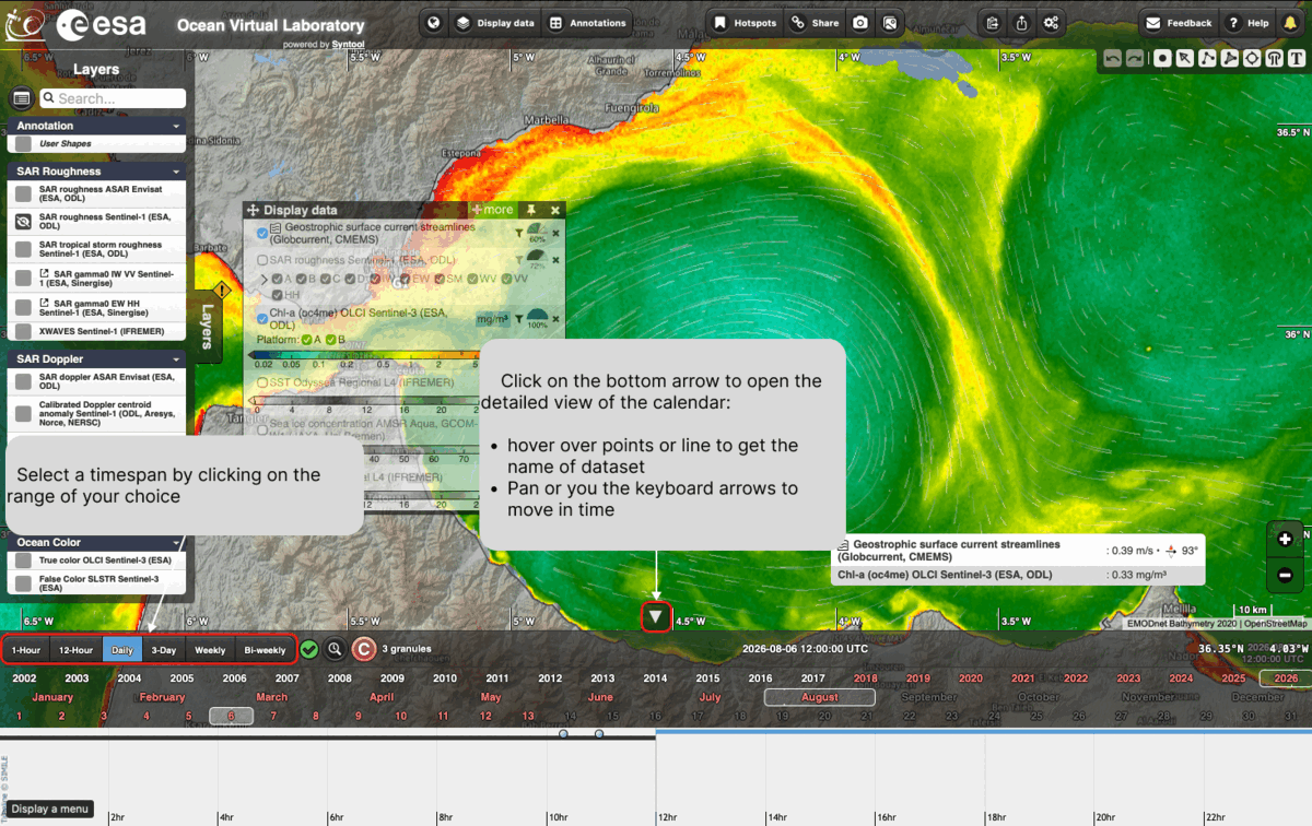
The buttons at the left end of the timeline — 1-Hour, 12-Hour, Daily, 3-Day, Weekly and Bi-weekly — set the timespan over which data are looked for. Click on the range of your choice. The bar then shows the date being displayed and the number of granules found for it.
The detailed timeline
The detailed timeline is a detailed view of the calendar showing the window used to search for data (timespan) and where the granules actually are in time.
Click on the arrow at the bottom edge of the map to open it. The detailed calendar opens under the timeline, with the hours of the selected day along it and one line per dataset. In this view you can:
hover over a point or a line to get the name of the dataset
pan, or use the keyboard arrows, to move in time
Collocation
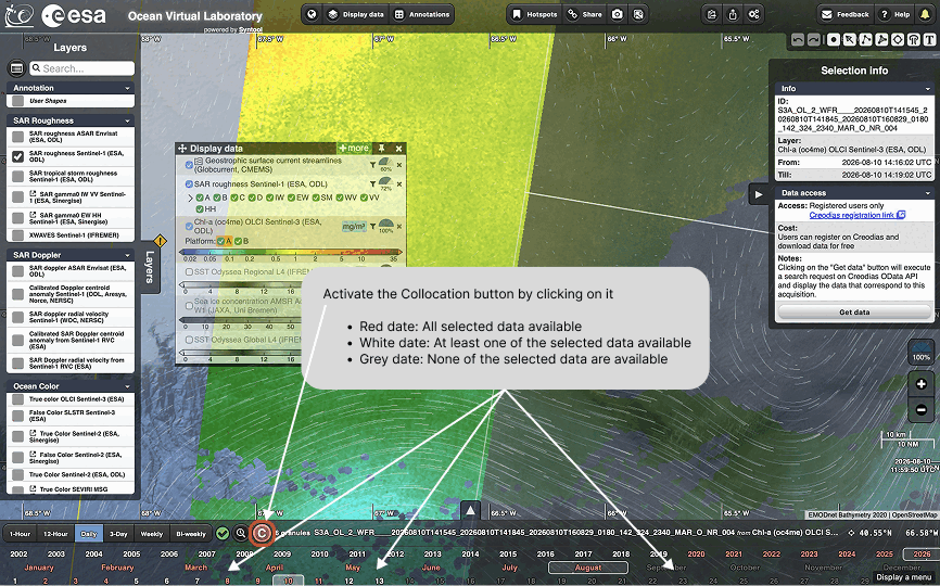
Activate the collocation button — the circled C at the left end of the timeline — to see when the products you selected are available in your time and geographical window. By default, this option is activated. The dates on the timeline are then colour-coded:
red — all the selected data are available
white — at least one of the selected data is available
grey — none of the selected data is available
The Display data panel
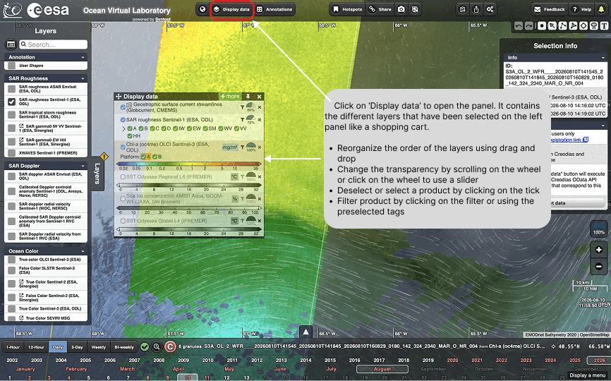
Click on Display data in the top toolbar to open the panel. It contains the layers you selected in the left-hand panel, like a shopping cart, and is where you control how they are drawn:
reorder the layers by drag and drop
change the transparency by scrolling on the wheel, or click on the wheel to use a slider
deselect or select a product by clicking on its tick
filter products with the filter icon or with the preselected tags
How to search and select products
How to compare data playing with layers
Getting the data from the provider
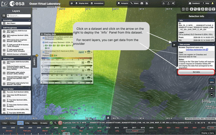
Click on a dataset, then on the arrow on its right, to deploy the Info panel for that dataset. It gives the granule identifier, the time coverage of the layer, and the conditions to access the data.
For recent layers you can retrieve the data from the provider: the Get data button runs a search request against the Creodias OData API and displays the products corresponding to your acquisition. Access is restricted to registered users, but registration on Creodias is free.
Rendering parameters
Colorbars / transparancy / 1
Annotations
Annotations are the shapes you draw on the map yourself. They are stored in your browser, and can be edited and exported at any time.
Drawing a shape
Select “User shapes” in the list of products (in the Annotation group), the product will automatically be selected when choosing one of the drawing tools
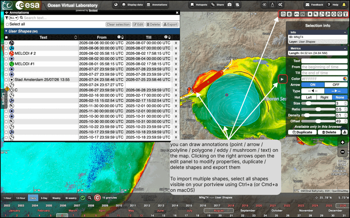
A box with shapes is located on the top right, you can choose between point, arrow, polyline, polygon, eddy, mushroom or text
Select the desired shape and click on the map to draw. Hold the click button for continuous drawing
You can select a single shape by clicking on it or an ensemble of shapes using Ctrl+A (or Cmd+A on mac), you can edit your selection and export them using the right panel
Click on the arrow on the right of the map to open the edit panel of the selection. It gives the metrics computed for the shape — the length of a polyline, for instance — and lets you change its text, its colour, the period over which it is displayed, and the way it is drawn: arrow on or off, type, size, ratio, density and offset. The same panel duplicates, deletes and downloads the selection.
The annotations panel
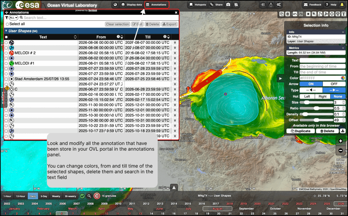
Click on Annotations in the top toolbar to look at and modify all the annotations stored in your OVL portal. The panel lists the user shapes with their text and the period they cover.
From this panel you can search in the text field, tick the shapes you are interested in or use Select all, and then Edit the selection — colours, and the From and Till times — Delete it, or Export it.
Importing and exporting shapes
Shapes are not locked into the portal. They can be written out to a file and read back in, in the formats supported by OVL — KML, GeoJSON and JSON among them.
To export, use Export in the annotations panel for the shapes you selected, or the download button of the edit panel for a single shape or all shape visible in the viewport. To import, use the import button in the top bar of the window.
Look at the Youtube tutorial video for more features:
How to draw a synoptic chart
Transects and extractions
Extracting values along a line, and exporting the result.
How to measure a length
Lagrangian advection
Hotspots
Bookmarked case studies: what they are and how to use them.
Sharing
Sharing the current view by URL, and creating shareable bookmarks with previews through SEAShot.
Preferences and personal data
Importing and exporting your settings and personal data.